Brand Guide
Meet Pennie
In its simplest form, Pennie stands for “Pennsylvania Insurance Exchange.” But we know Pennie has more personality than that. To serve all Pennsylvanians effectively, Pennie may play different roles:
Educator
Advocate
Troubleshooter
Merchant
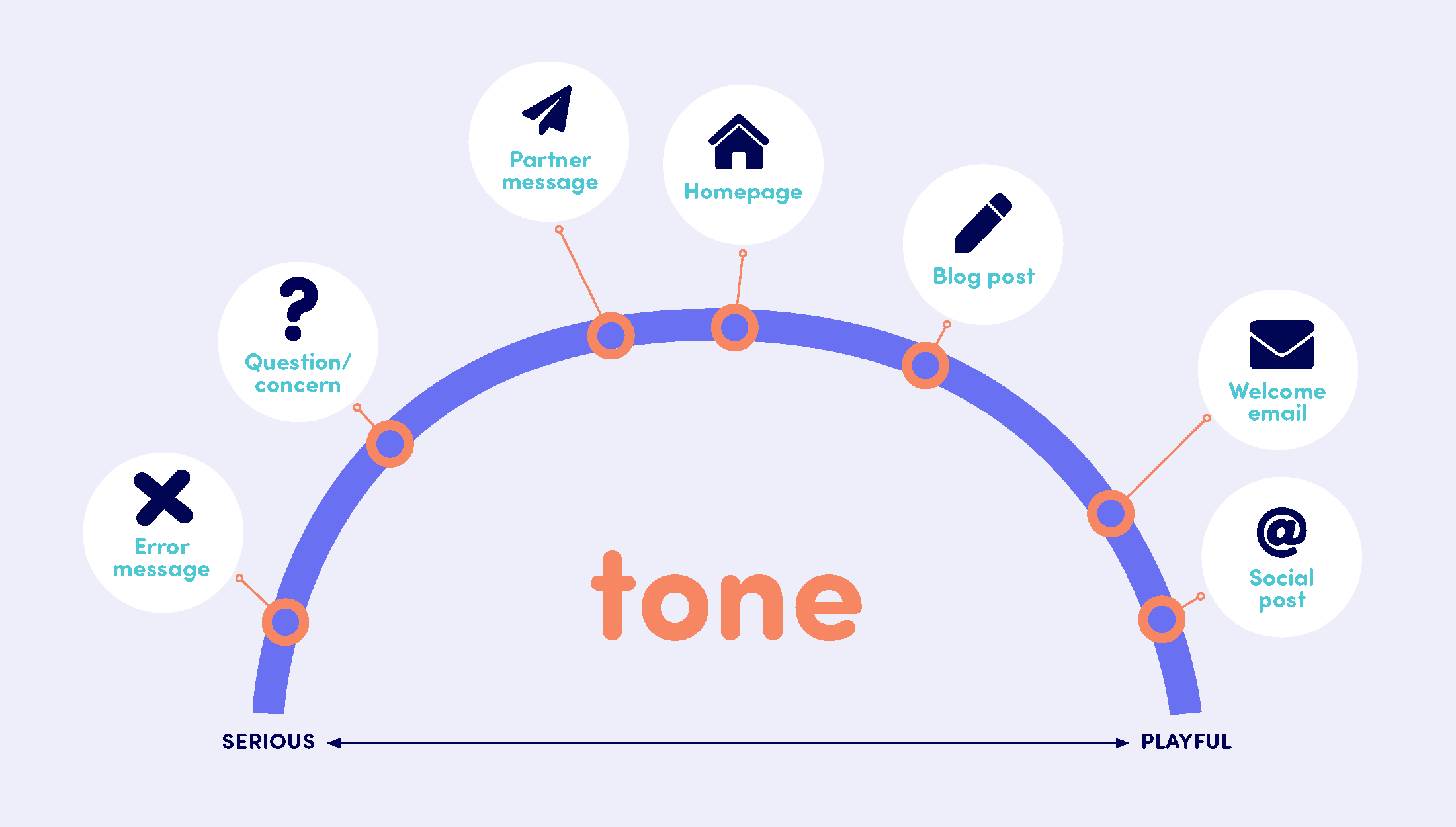
Voice & tone
The way we express the Pennie brand verbally will always use an underlying voice and tone. What’s the difference?
Pennie’s voice
Pennie’s voice doesn’t change. No matter what, Pennie will always be friendly and helpful.
Conversational
Pennie is informal and friendly, but in a genuine way, not a performative one.
Plainspoken
Pennie uses simple and direct language. We do use the industry’s vocabulary but include a translation into simpler terms.
Accessible
Pennie is a friend to all Pennsylvanians, no matter their age, race, gender, socioeconomic status or beyond.
Look & mood
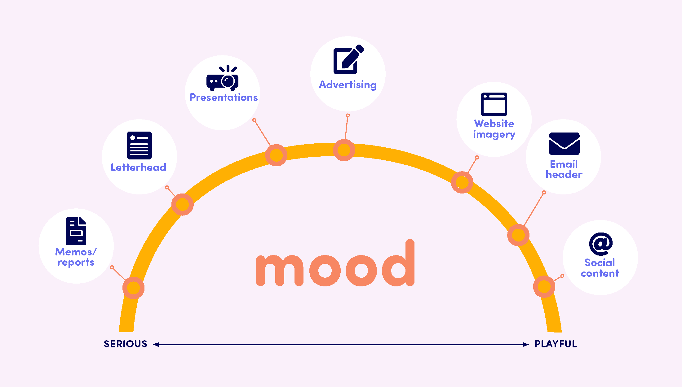
Just like voice and tone, we’ve defined the way we express the Pennie brand visually, through look and mood. The way they differ is similar to voice and tone …
Pennie’s look
Pennie’s look doesn’t change. Visuals will always be …
Simple
Visually, less is more. This keeps information from becoming buried and users from becoming distracted or confused.
Vibrant
Pennie bucks the dull image of health insurance. Our bright personality comes through in color palette, photography, illustrations and beyond.
Authentic
The imagery reflects the human side of Pennie by featuring real, everyday Pennsylvanians and genuine relatable moments.
Pennie’s mood
Pennie’s mood changes to consider context.
- A welcome email may be playful, with modern layouts and fun illustrations.
- A reference to emergency care may be a more serious, traditional text-driven layout that leans on photography.
- Complementary brand elements can help break up complex topics and bring life to simple statements.
Point of view
How to refer to Pennie
You may use one of two options when referring to Pennie in communications:
Pennie is Pennie
Use the brand name to reference Pennie in the third person: “Pennie makes it easy to find health insurance.”
We are Pennie
Use first-person plural to deliver a more empathetic message: “We make it easy to find health insurance.
Note: Pennie should maintain an uppercase “P” in all written content. Exceptions: Logo and URLs.
How to refer to our audience
We always speak directly to our audience; therefore, we use the second-person point of view.
Writing style
- We use active voice to be more direct and less wordy.
- The health insurance industry tends to speak its own language. Pennie will use this language, but act as a translator for our audience, making it easier for all to grasp.
- We want Pennie to be uplifting, so do your best to write positively and avoid negative words.
Brand marks
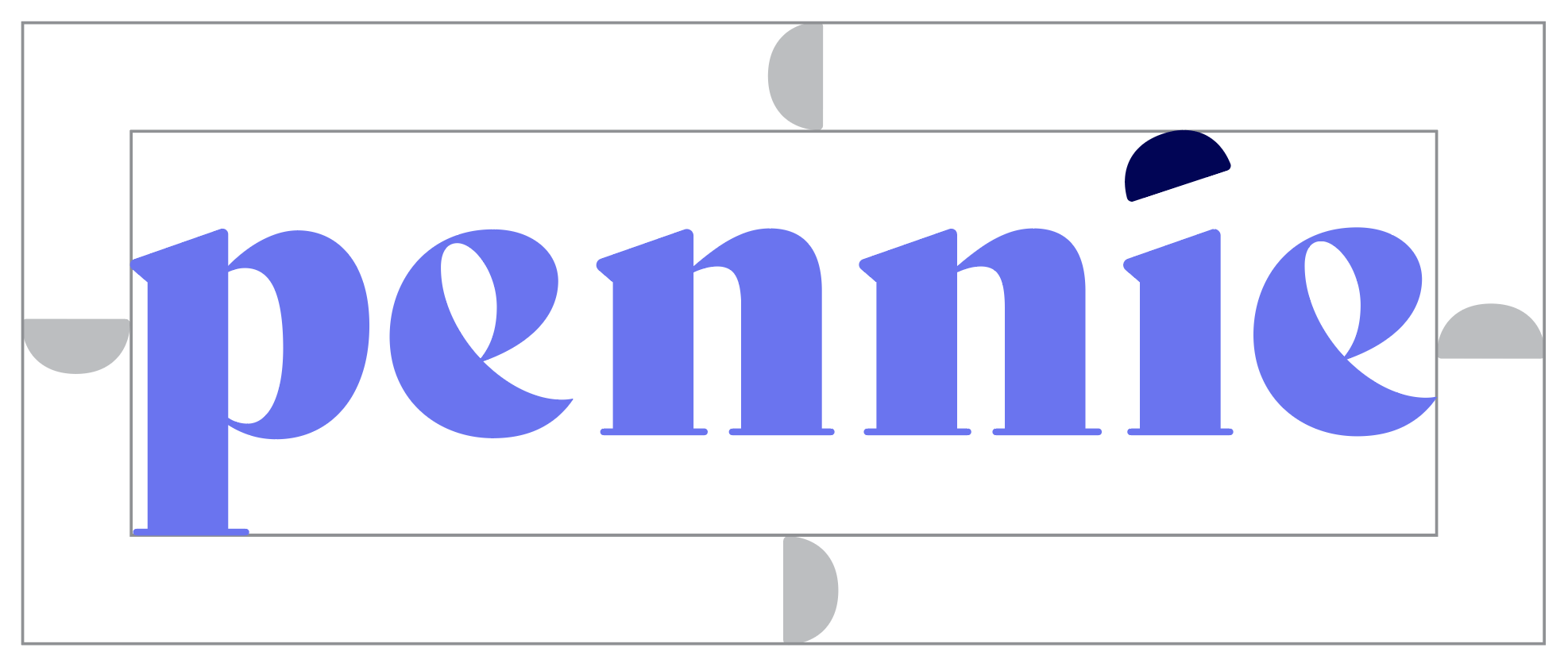
Pennie’s brand marks are simple and friendly, staying true to the spirit of Pennie. The Pennie logo can be displayed in any of the four foundational brand colors. The cap over the “i” should always remain in navy in full-color logos. In applications that require the Pennie logo to be laid over a dark background, the logo mark should be white, and the mark over the “i” should be placed in a corresponding foundational color.
Colors
Pennie’s color palette is full of possibility. Our expansive color palettes are a true reflection of our personality: positive and friendly. The foundational brand colors can be used in various tints to add visual dimension when appropriate.
Foundational colors

Purple
RGB 103, 106, 245
CMYK 69, 63, 0, 0
HEX #676af5
CMYK 69, 63, 0, 0
HEX #676af5

Teal
RGB 69, 198, 211
CMYK 62, 0, 19, 0
HEX #45c6d3
CMYK 62, 0, 19, 0
HEX #45c6d3

Orange
RGB 248, 133, 94
CMYK 0, 60, 65, 0
HEX #f8855e
CMYK 0, 60, 65, 0
HEX #f8855e

Yellow
RGB 255, 177, 0
CMYK 0, 34, 100, 0
HEX #ffb100
CMYK 0, 34, 100, 0
HEX #ffb100
Brand Neutral Colors

Navy
RGB 0, 0, 88
CMYK 100, 98, 24, 40
HEX #000058
CMYK 100, 98, 24, 40
HEX #000058

Warm Neutral
RGB 255, 240, 237
CMYK 0, 6, 4, 0
HEX #fff0ed
CMYK 0, 6, 4, 0
HEX #fff0ed

Cool Neutral
RGB 228, 228, 247
CMYK 9, 8, 0, 0
HEX #e4e4f7
CMYK 9, 8, 0, 0
HEX #e4e4f7
Typography
Our typography is curated to be legible and approachable while helping customers navigate important information about health coverage. It is important to use sentence case across Pennie’s brand to convey the correct tone and make text easier to comprehend.
FreightBig Pro
FreightBig Pro for headlines and callouts.
Sofia Pro Soft
Sofia Pro Soft for subheads or pull quotes.
Sofia Pro
Sofia Pro for all body copy.
Montserrat
Montserrat for all digital applications.
Iconography
Using the cap and arch as building blocks, icons can be created to provide visual cues and add clarity around complex or conceptual content. In larger executions, line icons can be used to add a more dynamic effect. Solid icons should be used in executions that are smaller.
Line icons


Solid icons


Photography
Creative should use lifestyle photography, instead of editorial or cinematic photos. Avoid using mono- or duotones in Pennie’s photography. Photography should show people in positive moments to evoke the peace of mind that comes with having health coverage.


Partnerships
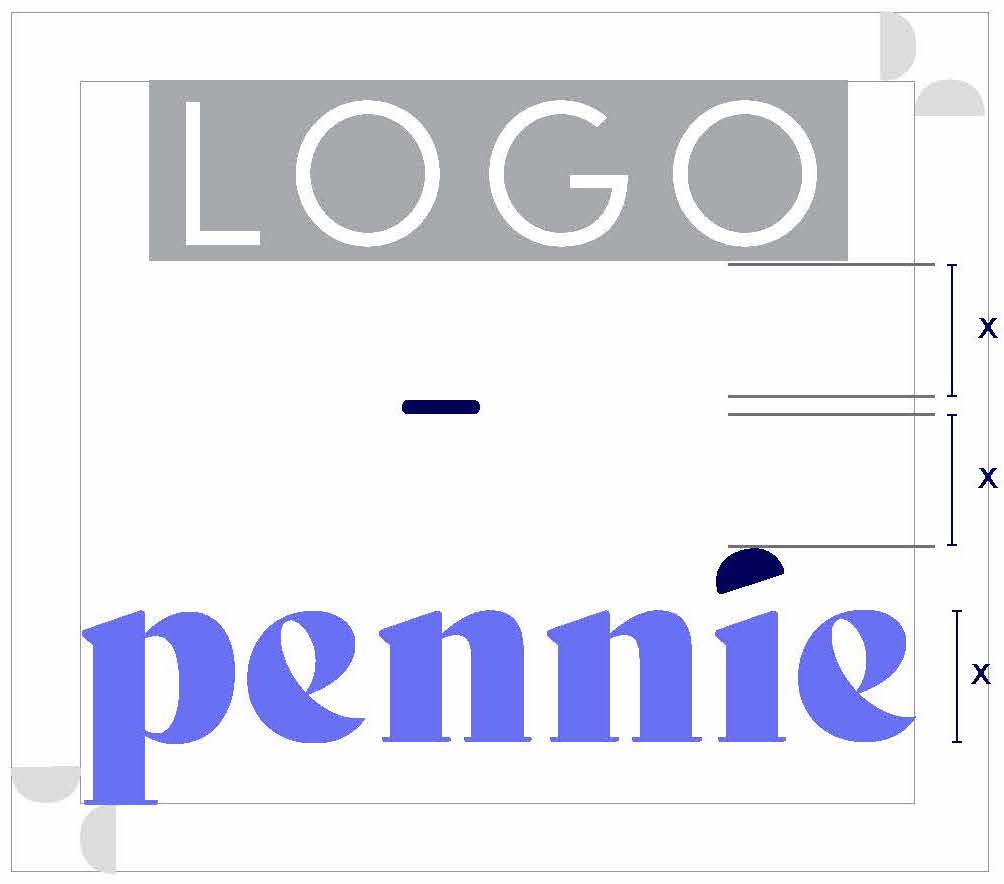
Just as partners are important to Pennie’s success, partners are also important in helping us maintain brand standards. Partners should adhere to the brand rules outlined below. The clear space between the Pennie logo and the partner logo is proportional to the x-height of the Pennie logo. Typically, the partner’s logo should come before Pennie’s. Partner logo height should match Pennie’s and align to the baseline of Pennie’s logotype.
